content
Title
Title
Case study
Improving user onboarding

Introduction
For the first two years of Kickbooster’s pledge manager, the app existed without a proper onboarding flow. Pledge manager allows crowdfunding creators to create a checkout for their backers, in order to collect their shipping information and to upsell additional campaign products. In the early days of pledge manager, the onboarding experience was a call between the user and a support person, guiding them through each step of a tedious setup. If there was no call, users would have been left to their own devices to figure out how to setup their pledge manager themselves. This task, though not impossible, was daunting for a new user because of the numerous steps needed to set up a pledge manager.
This was overall a poor experience for all parties involved. For the user, this was a poor experience in navigating the many steps of pledge manager, and assessing what’s necessary. The frustration of this setup often led to new users dropping off, which of course, was bad for the business. As well, the current way of onboarding was a drain on our support staff (and even other members of the team, as we were a small team) so making pledge manager self-serving would free up our team’s time.
🤔 Problem
Pledge manager didn’t have a proper, self-serving onboarding flow.
⛔ Why it’s bad for users
Users didn’t know what to do next nor how to go about setting up their pledge manager.
⛔ Why it’s bad for the business
The setup of pledge manager turned a number of potential customers away; and onboarding was taking up a lot of time from the team.
Project Details
🗒️ This case study will only cover the design phase of this project: how my thinking went about the problem, and how I came up with a solution.
Role
Product Designer
Responsibilities
Facilitating design, exploring concepts, loop users into project
Duration
2 Months [Design phase]
Other members involved
- Product manager
- Development team
- Support specialist
How we would measure success
Prior to the project, I discussed with my product manager metrics we could use to measure the success of this project. As the scope of this project grew to be quite large, affecting many parts of the app and user experience, we felt that no single metric could be used to reliably used to measure success. As we worked through this problem, we knew it would continue to be a work in progress (there’s always something to improve in any onboarding experience), so we established a set of particular metrics to track over time in order to have some measure of its impact.
Metrics to measure impact
User Activation Rate
Users who activated their pledge manager vs. users who signed up for pledge manager
Over time, an increase in this metric tells us more of our users who sign up, end up activating their pledge manager.
Setup Completion Time
Time between user signup and pledge manager activation
Ideally this metric would decrease over time, but we decided it’d be good to have an overall sense of the setup time. We could use this in the future to compare pledge manager setups and assess why a setup took more or less time than the average.
Intercom Inquiries
Number of support inquiries with the pledge-manager-help tag in Intercom
Quite simply, a decrease in this tag tells use less users are experiencing (immediate) difficulty with their setup
Customer Effort Score (CES) survey
A quick survey asking users to rate their setup experience and provide a text field should they have anything they want to comment on about their experience.
This gives us a general idea of the overall setup process, and provides a medium to collect qualitative feedback about the onboarding experience.
Understanding the Problem
To kick off this project, lots of discussions were had with my product manager, support staff, and other team members who were aware of pledge manager’s onboarding issues. Those members had plenty of one-on-one’s with users, walking them through the app and understanding firsthand the pain points of our product. With this collective knowledge, I felt that additional user interviews weren’t necessary at this stage.
Outlining issues with our current “onboarding”.
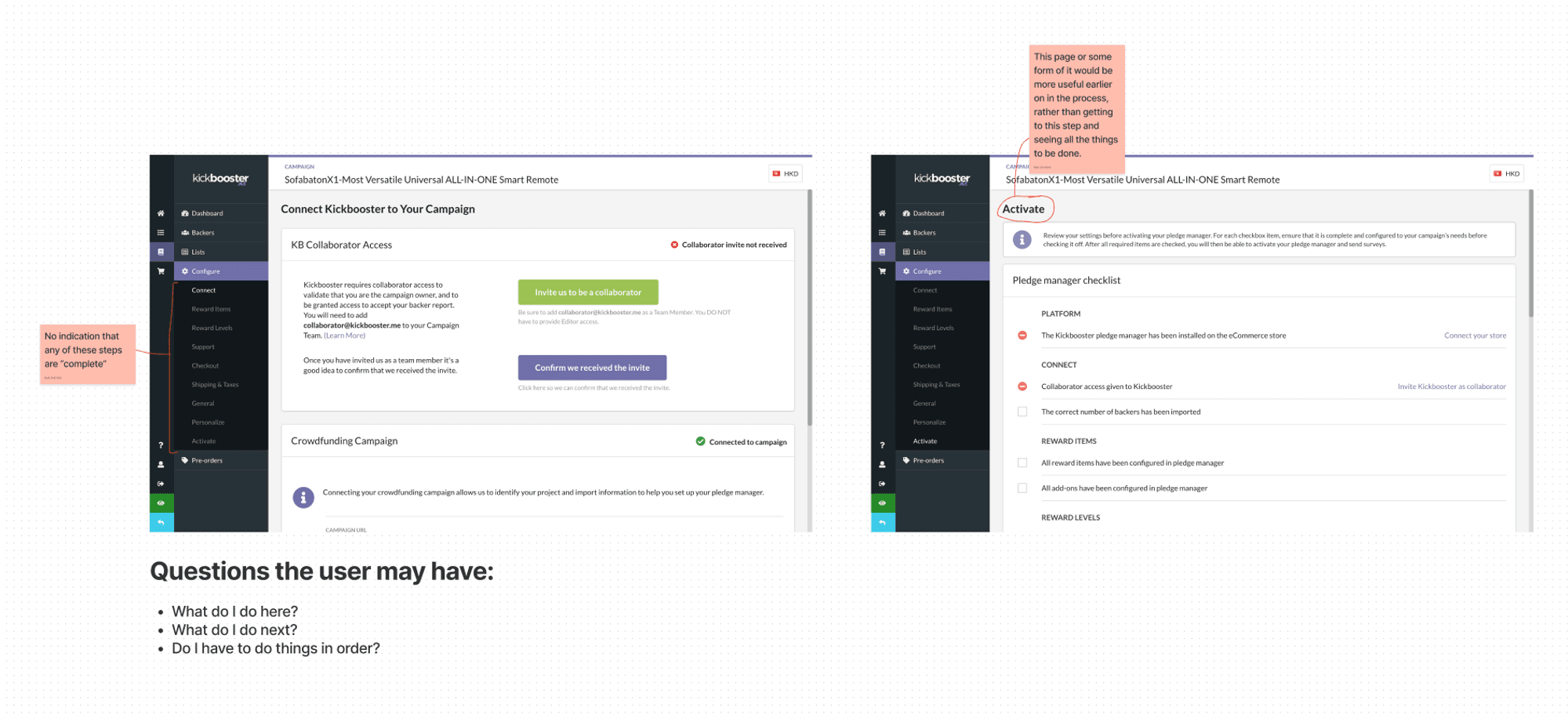
From these chats and my own audit, the main problems with the current (lack of) onboarding flow were:
⛔ No introduction to the app; nothing telling the user where they are nor what to do
✅ A welcome screen of some sort
⛔ Nothing showing users what to do next, or what is left to do
✅ A list of actions to take (or opt not to take) in pledge manager
⛔ No indication that any step of pledge manager is “complete”
✅ A means of checking off a step from the list
With the “fixes” above in mind, many ideas were generated for what a solution might look like. In a FigJam board with my product manager and lead developer, we walked through screenshots of pledge manager and sketched some ideas of what could be helpful to users. As well, we kept in mind that some parts of the app could be repurposed to solve some of these problems and thought about how those would factor into the long-term vision of pledge manager’s onboarding.
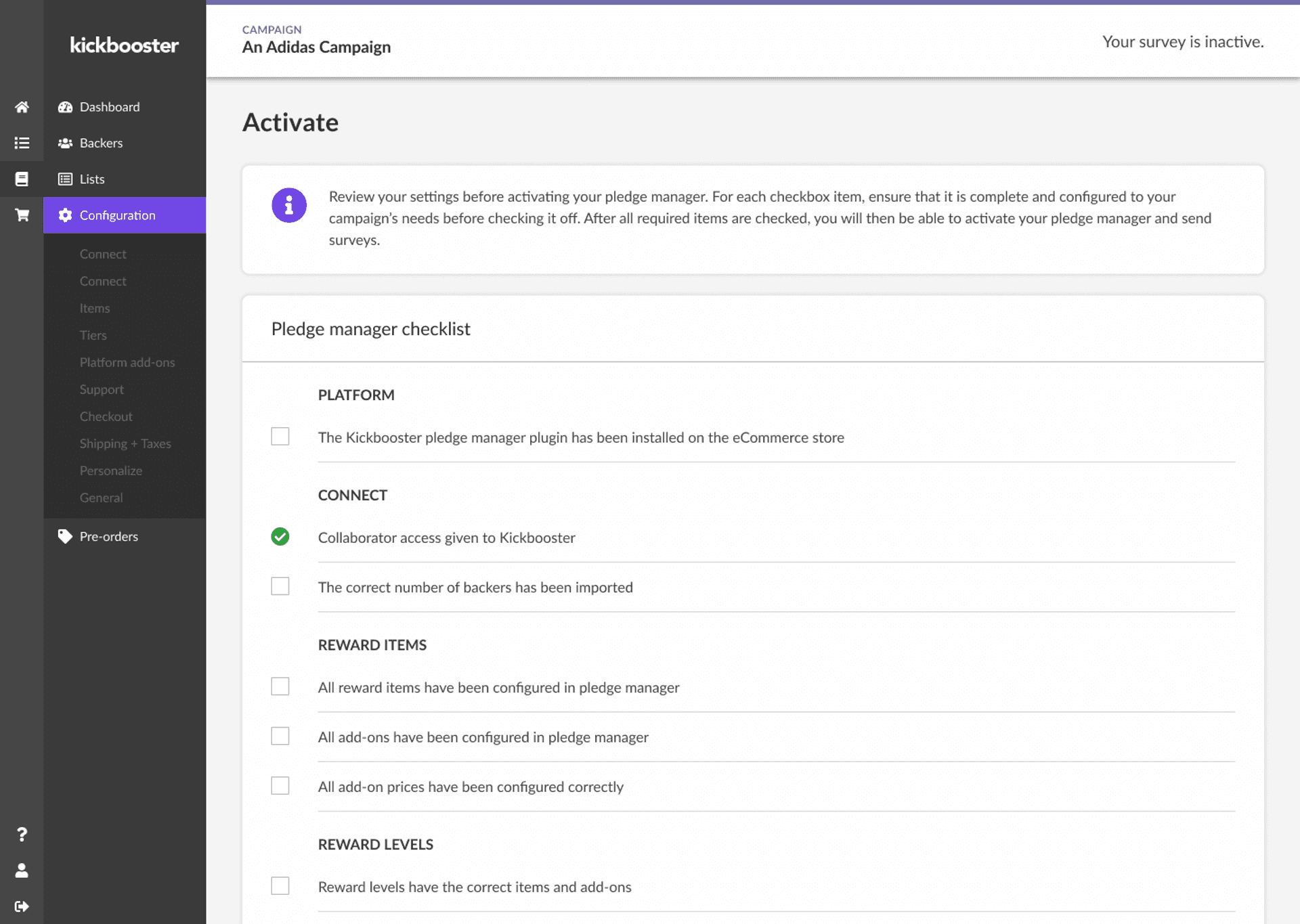
The pre-existing activation page containing the master checklist, which we wanted to be able to use throughout all of pledge manager (and not just on a singular page).
There was an existing “Activation” page, which acted as the final checklist before activating pledge manager. This page contained all the steps needed for pledge manager, and we wanted to better leverage that list into something that could be interacted with throughout pledge manager (and not just one page).
We also wanted to take this opportunity to revisit the checklist and be clearer with each item on the list. Some items needed to be done before others; some items were optional; and other items could be done at any point in the setup process.
With my product manager, we combed through the checklist and refined the many steps that go into pledge manager.
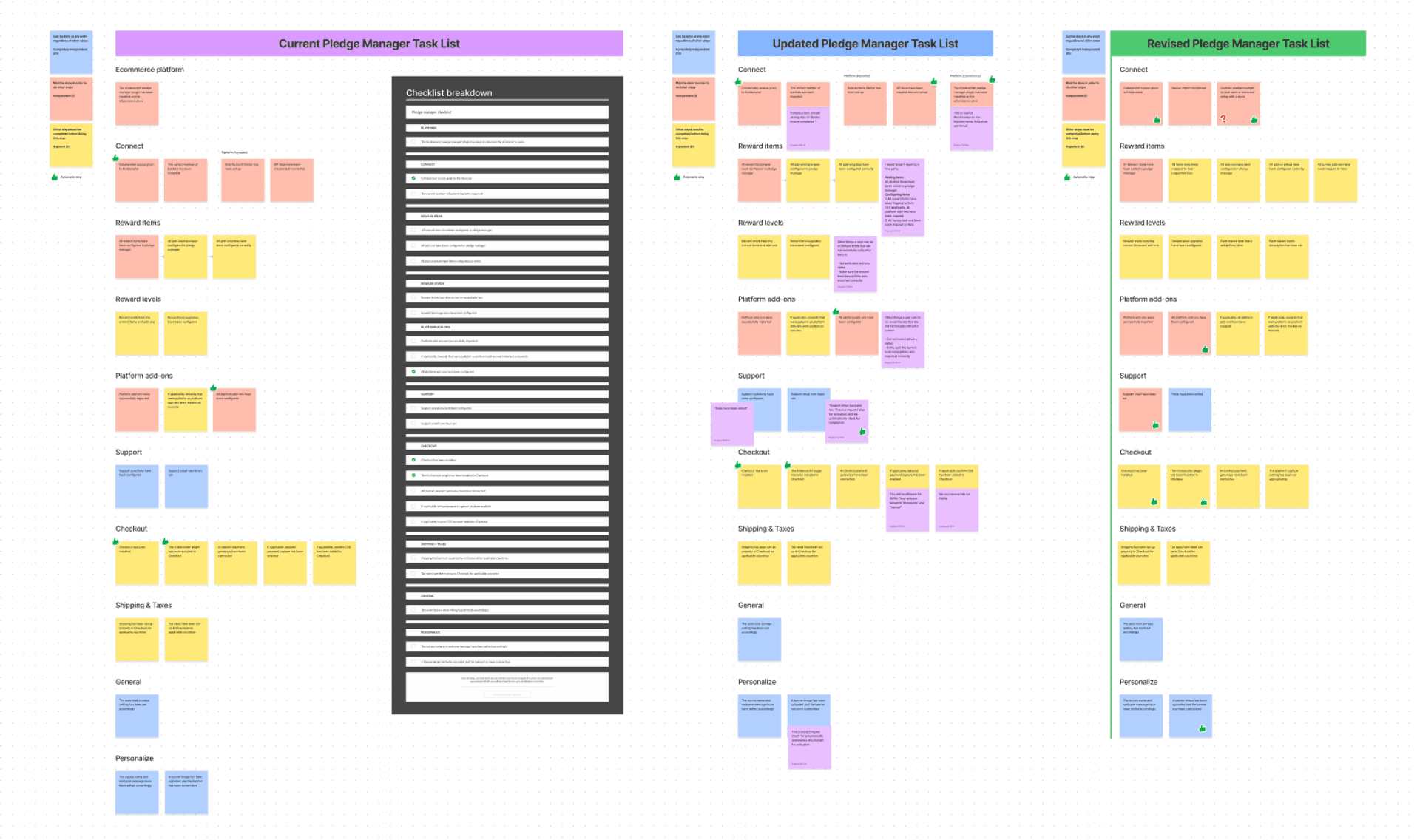
By the end of this stage, we had the goal of taking the master checklist (from the activation page) and remodeling it into two additional modalities that the user could access. Then, we felt this was a good direction, as it would turn existing backend infrastructure into something more useful for users. We envisioned the checklist existing in three places:
The existing activation page
A starting (get started) page
A panel component, which is what we called the UI that would be available on each page of the pledge manager setup
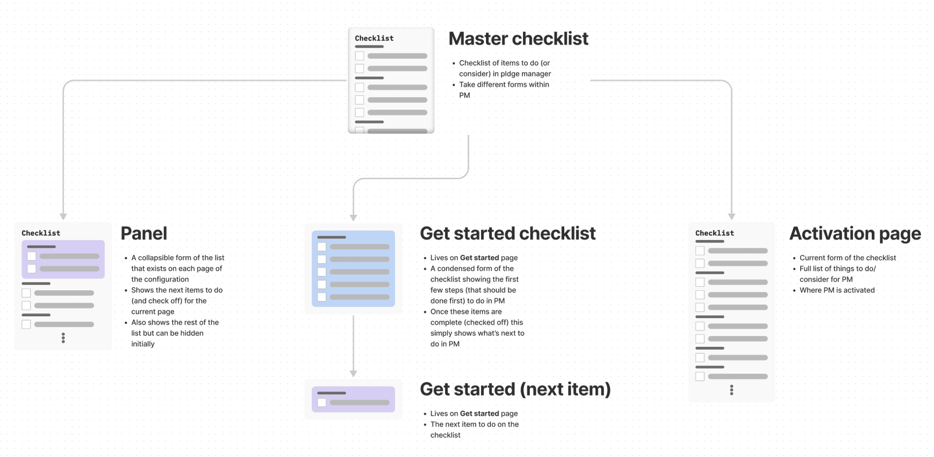
Splitting the master checklist into different modalities.
Exploration
First iteration
With this master checklist framework in mind, exploration was a means to flesh out, iterate and validate ideas. This took the form of putting together different options for each of the different modalities and receiving feedback from the team, on what makes sense and what is feasible, given our system today.
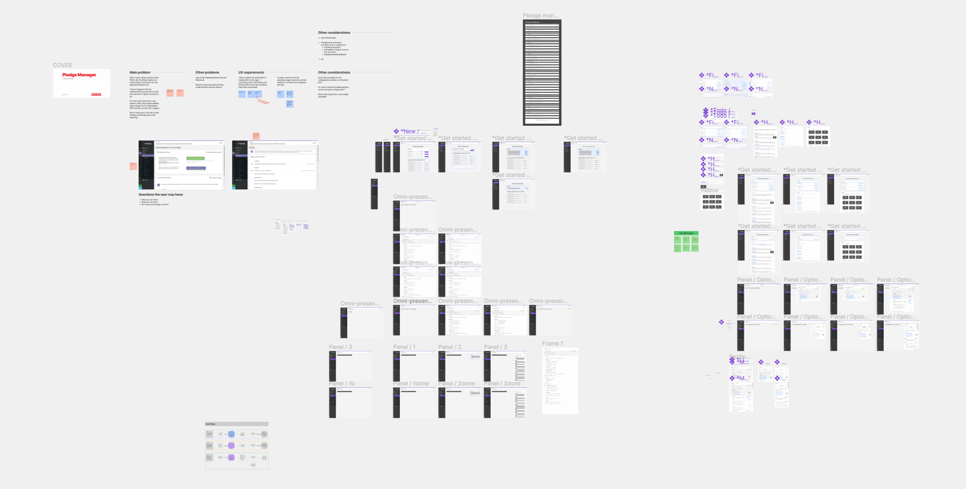
Initial exploration file for onboarding.
Various options were explored for the new two modalities, the starting page and the panel component.
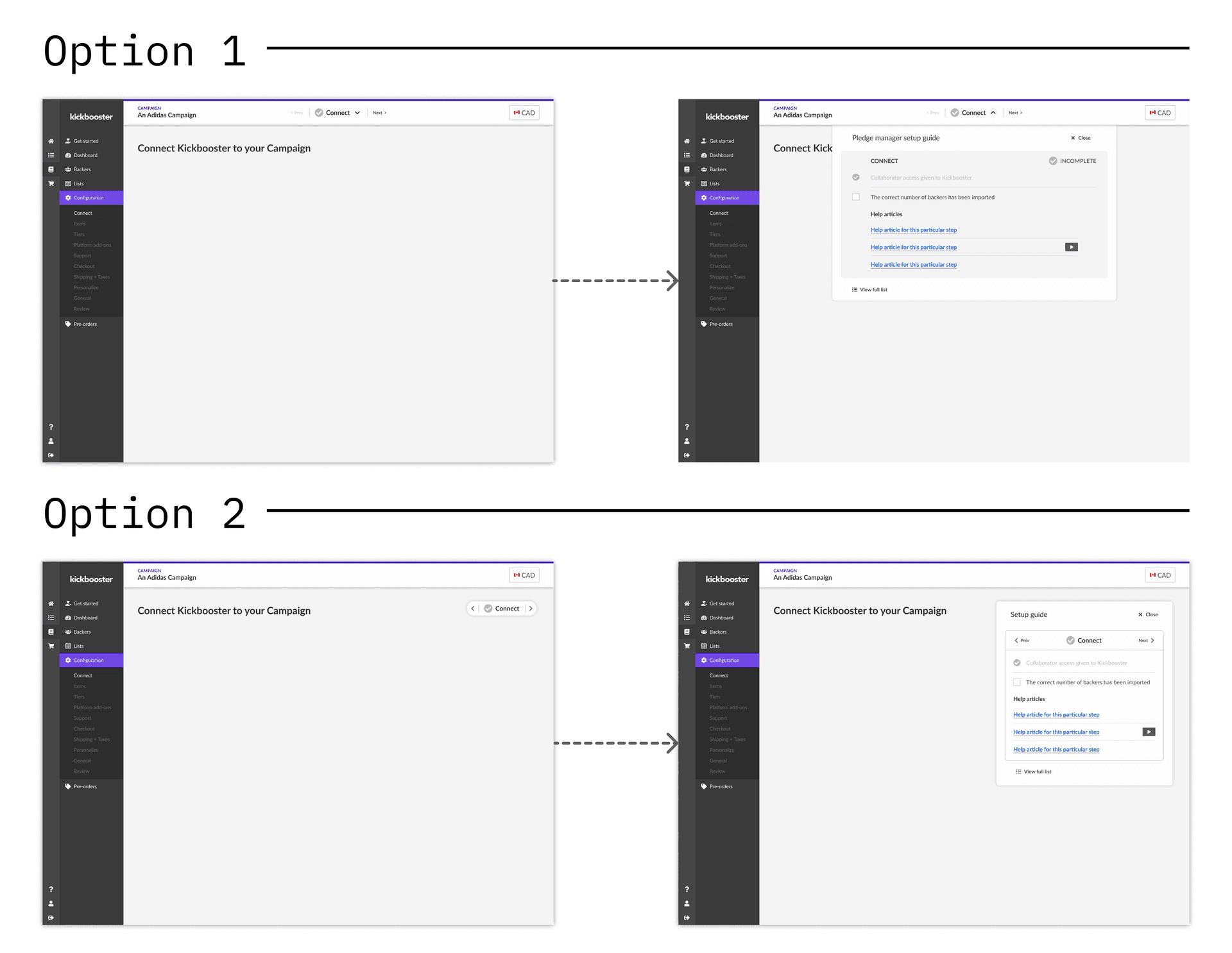
Two options for the panel component. Option 1 “highjacks” the pre-existing navigation bar in our system and reveals a dropdown of the list items; whereas Option 2 introduces a new fixed “pill” that can be expanded into the list items.
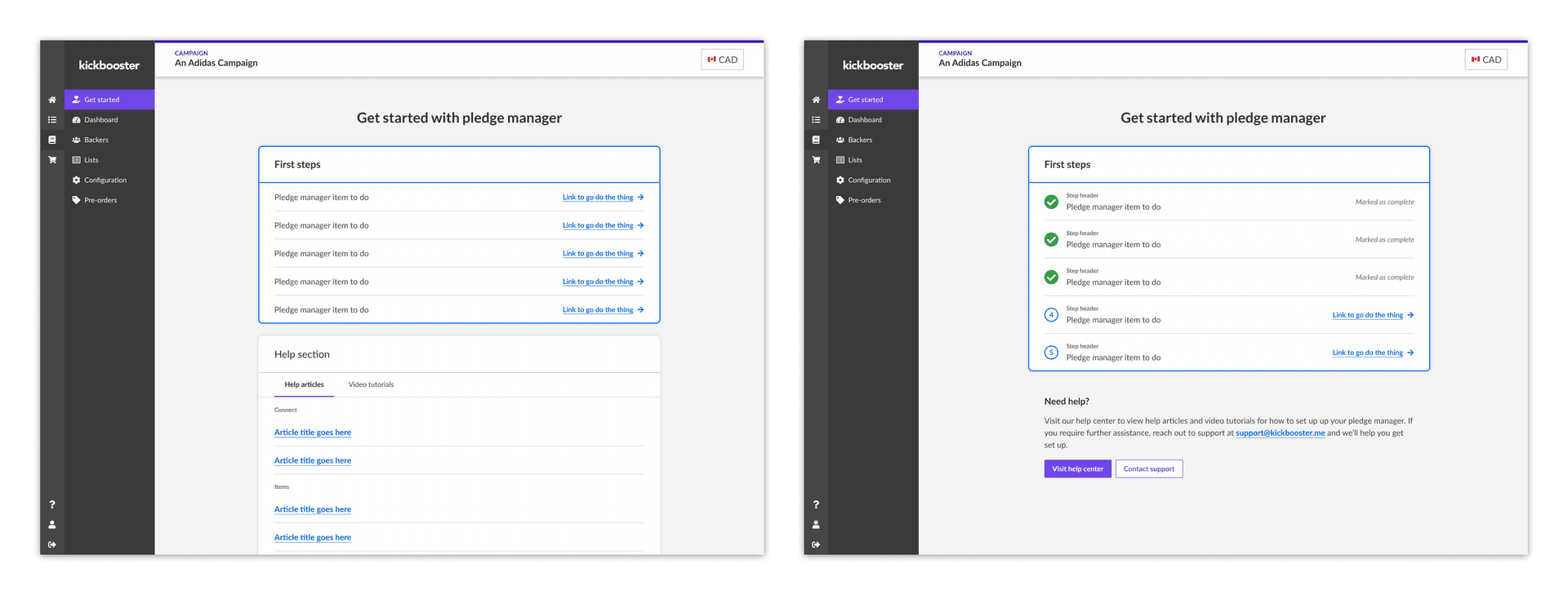
Two (of many) options for the starting page.
When I felt my exploration was in a state to be presented, I held feedback sessions with various groups: my product team, the non-product members of Kickbooster, and the Bold design team. Each group has a different lens into the feature, so each of their feedback is very valuable.
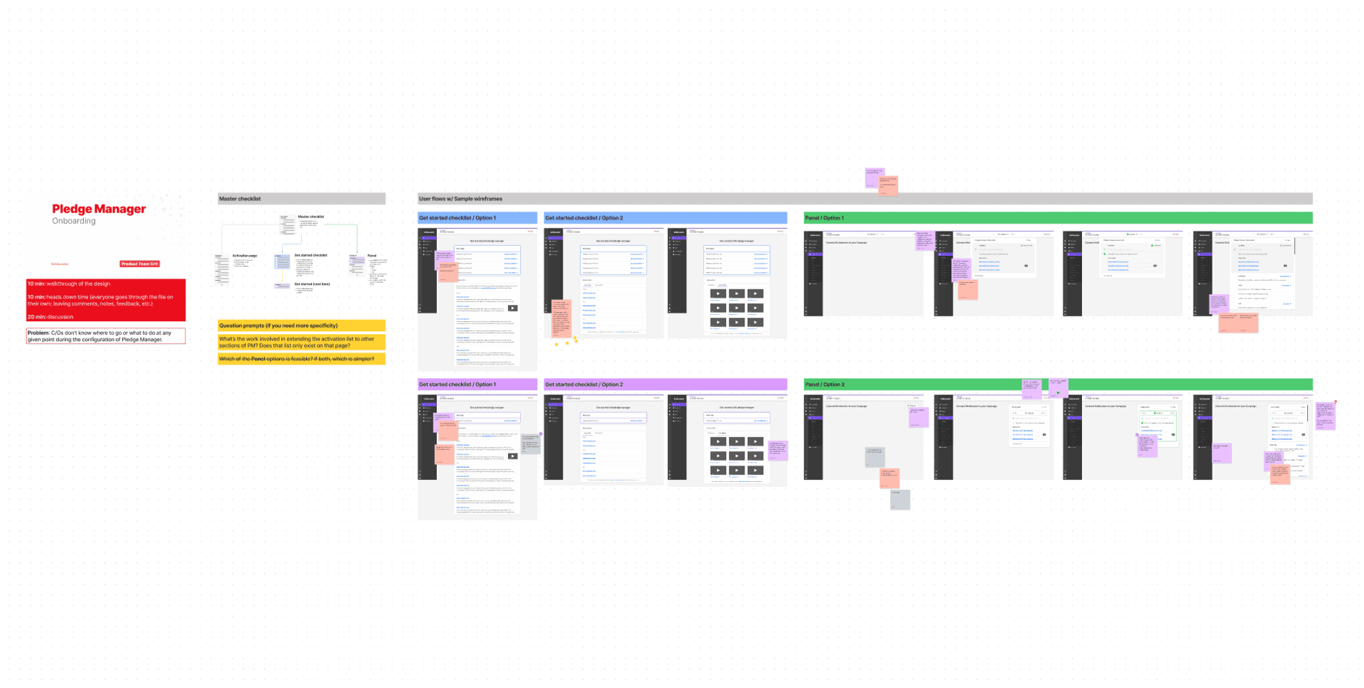
Screenshot of the FigJam board for the product team feedback session.
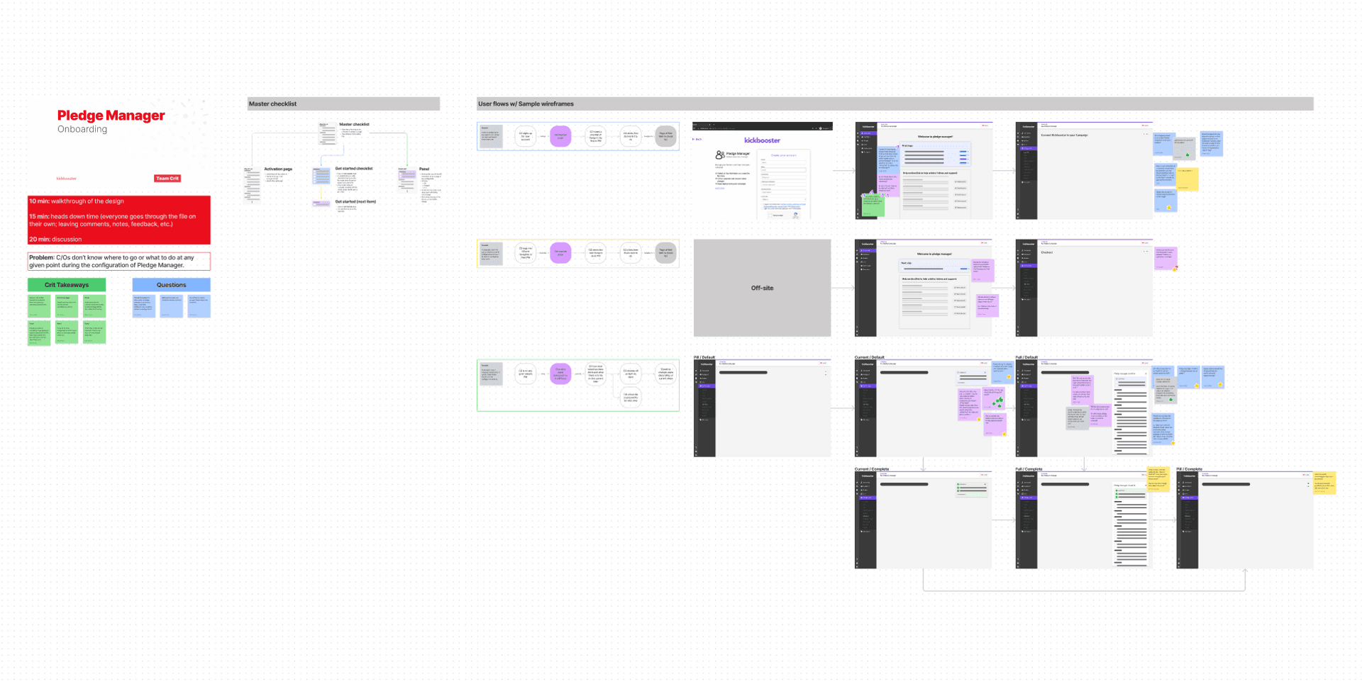
Screenshot of the FigJam board for the non-product team feedback session.
In addition to these feedback sessions, I had plans to receive user feedback on our work thus far. Initially, I wanted to play around with Maze and use that as a vehicle for user feedback, but unfortunately it wasn’t approved in time so I put together a small Figma prototype with a regular survey at the end. Ultimately, these user feedback surveys weren’t a factor in our decision-making, as we only received 5 responses out of the 20+ surveys we sent out. Even though most of the respondents favored the introduction of the new UI, we felt it wasn’t a response large enough to lead our decision-making.
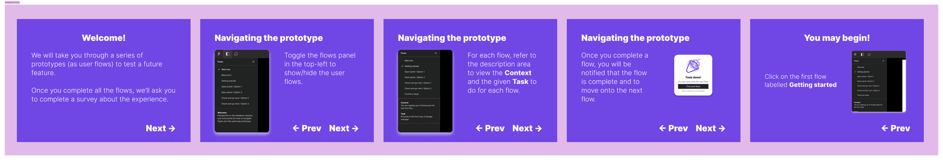
Onboarding prototype - Introduction screens.
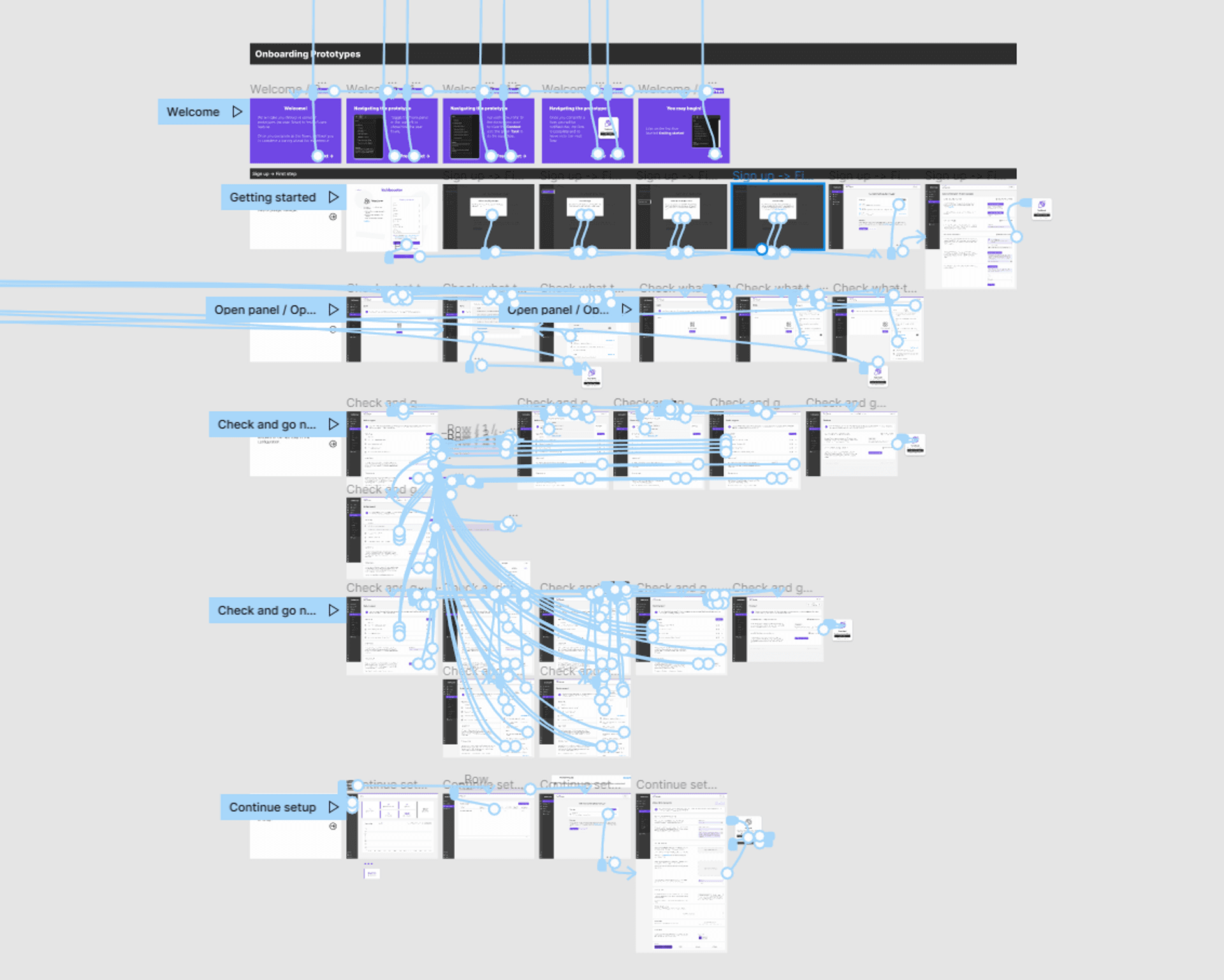
Prototyping in Figma is fun! 🎉 I’m not crazy…
Pivoting feature direction
What was the factor in our decision-making was a point made by our lead developer. During a feedback session with the product team, they noted that a lot of work would have been required to create the new components of the feature, which generally isn’t an issue. Though, without strong evidence (i.e. our user surveys were unfruitful) that it was the best means to solve our onboarding problem, we suspected it may not have been worth the technical effort. We saw value in the designs that had been explored, but we opted to exclude the panel and starting page from the initial version of this feature.
Instead, we turned our attention to how we could better make use of the existing activation page. Again, to best solve our onboarding woes, the activation needed to do the following:
Act as a welcome screen to the app
Display the list of tasks to do within pledge manager
Show a means of completion when a step is done
Second Iteration
Because the activation was inherently a checklist, it already ticked off two of our criteria for an onboarding solution. All that was left was to make it the landing page of pledge manager.
😅 It sounds obvious in hindsight, but perhaps our team became a little too fixated on introducing something new for us to see that we already had 2/3 of a solution in the app already.
We knew this page could be more than it currently was, and someone suggested during a feedback session the idea of segmenting the different sections of the setup.
What this exploration ended with was a more dynamic activation page, which we now called the Overview page, that:
Introduced users to pledge manager
Showed users the next task in the list, while pushing completed task to the bottom
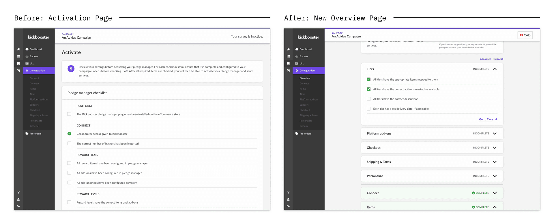
Activation Page: before and after.
Final design
For the initial version of the onboarding flow, we purposed the old Activation page into a new page called Overview. This new page would become the new landing page of pledge manager and would be dynamic, in that each section of pledge manager is sectioned off and would change visually based on its state of completion.
New section components
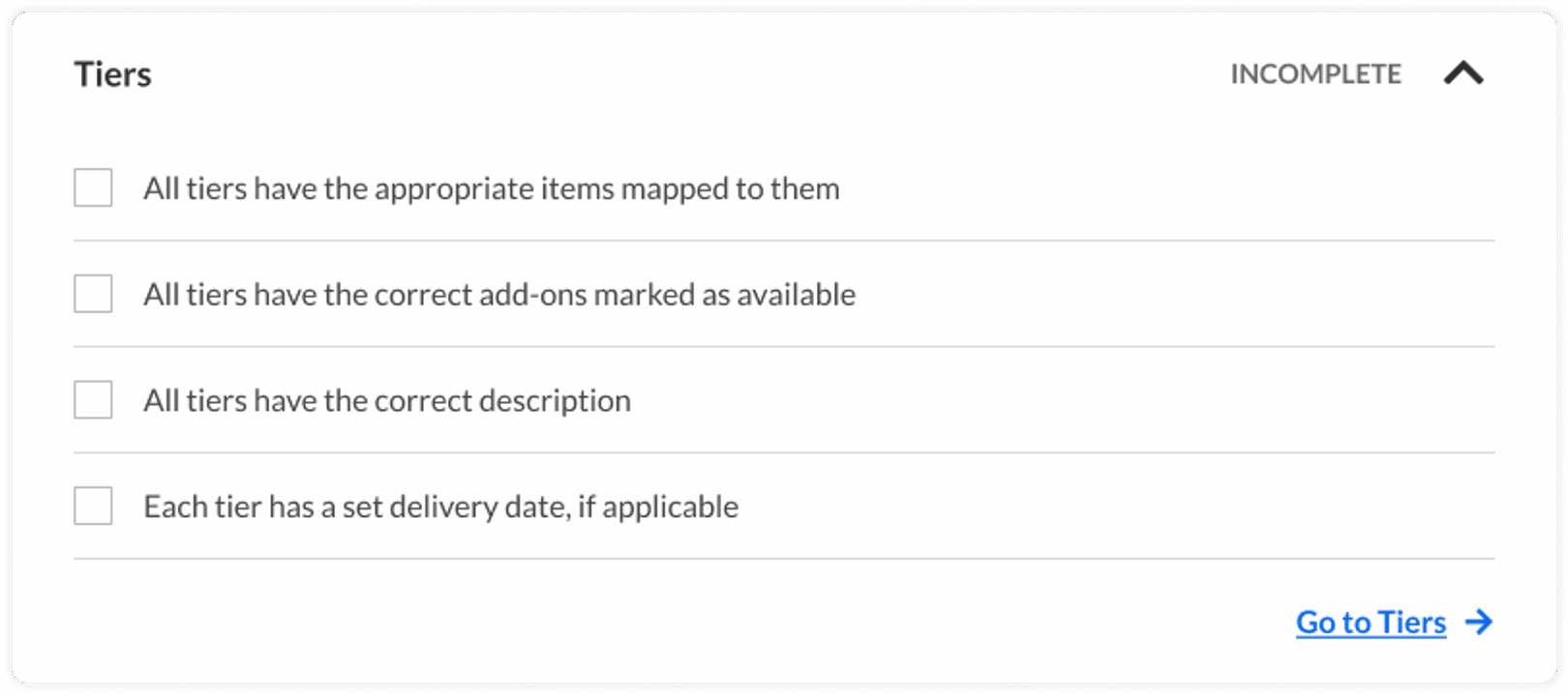
Tiers - Incomplete - Collapsed
Tiers - Incomplete - Expanded

Tiers - Complete - Collapsed
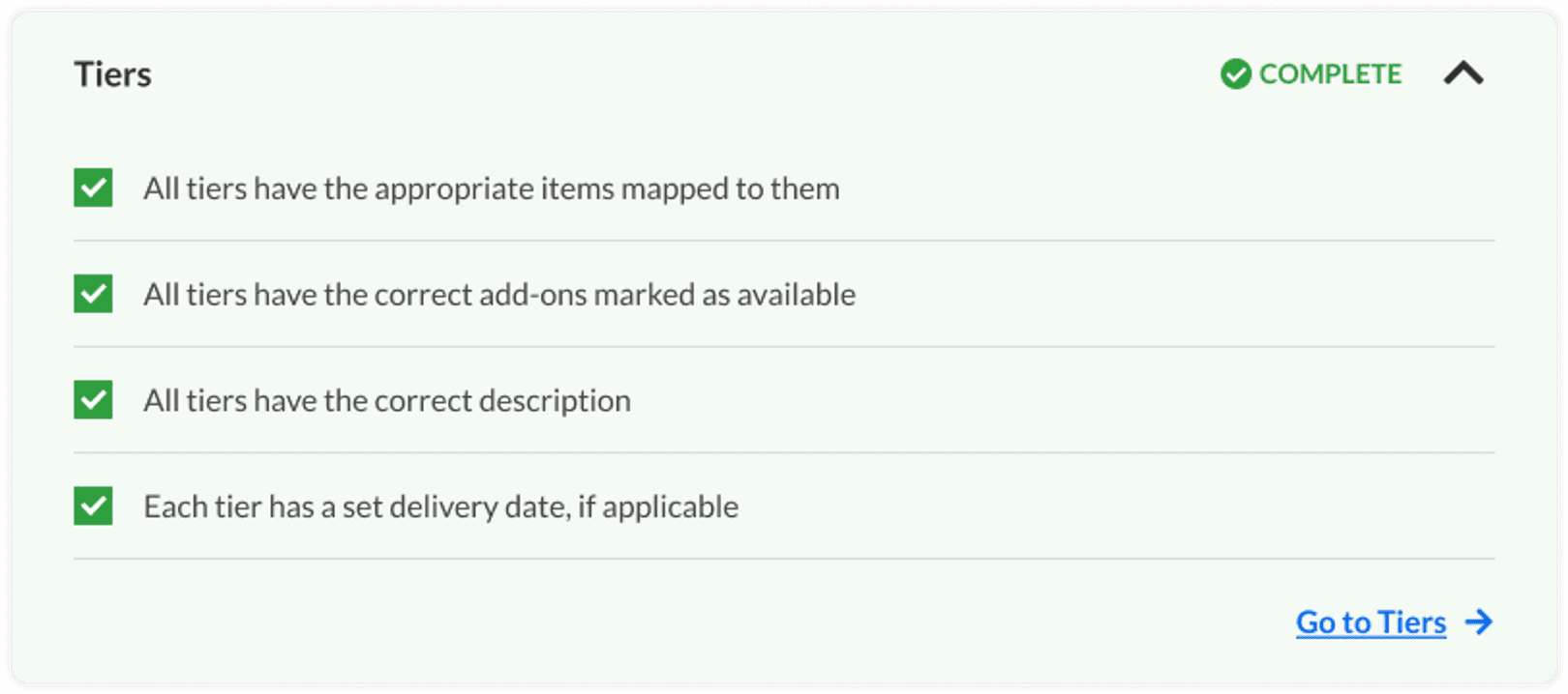
Tiers - Complete - Expanded
Overview page - States
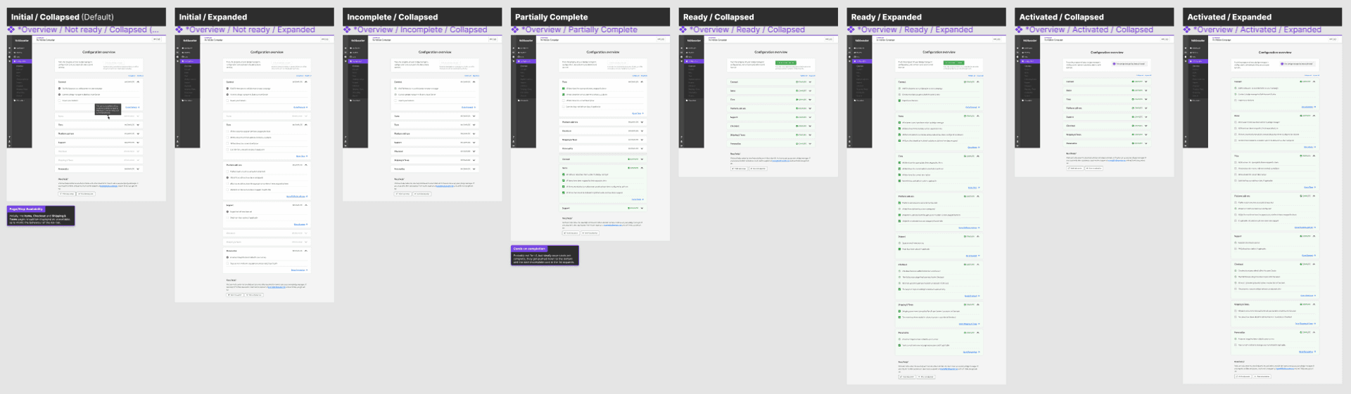
Each state of the new Overview page.
Overview Page - Specs
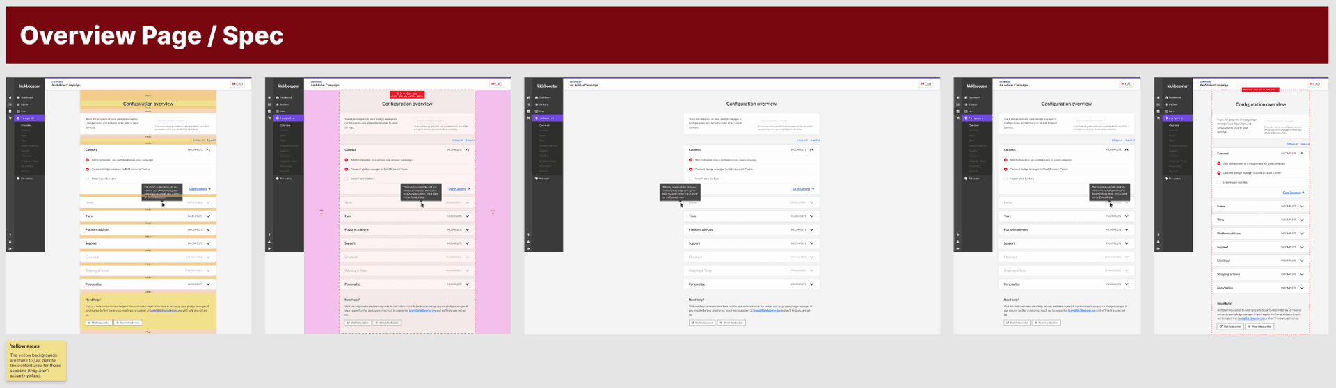
Visual specifications of the Overview page.
Introduction
For the first two years of Kickbooster’s pledge manager, the app existed without a proper onboarding flow. Pledge manager allows crowdfunding creators to create a checkout for their backers, in order to collect their shipping information and to upsell additional campaign products. In the early days of pledge manager, the onboarding experience was a call between the user and a support person, guiding them through each step of a tedious setup. If there was no call, users would have been left to their own devices to figure out how to setup their pledge manager themselves. This task, though not impossible, was daunting for a new user because of the numerous steps needed to set up a pledge manager.
This was overall a poor experience for all parties involved. For the user, this was a poor experience in navigating the many steps of pledge manager, and assessing what’s necessary. The frustration of this setup often led to new users dropping off, which of course, was bad for the business. As well, the current way of onboarding was a drain on our support staff (and even other members of the team, as we were a small team) so making pledge manager self-serving would free up our team’s time.
🤔 Problem
Pledge manager didn’t have a proper, self-serving onboarding flow.
⛔ Why it’s bad for users
Users didn’t know what to do next nor how to go about setting up their pledge manager.
⛔ Why it’s bad for the business
The setup of pledge manager turned a number of potential customers away; and onboarding was taking up a lot of time from the team.
Project Details
🗒️ This case study will only cover the design phase of this project: how my thinking went about the problem, and how I came up with a solution.
Role
Product Designer
Responsibilities
Facilitating design, exploring concepts, loop users into project
Duration
2 Months [Design phase]
Other members involved
- Product manager
- Development team
- Support specialist
How we would measure success
Prior to the project, I discussed with my product manager metrics we could use to measure the success of this project. As the scope of this project grew to be quite large, affecting many parts of the app and user experience, we felt that no single metric could be used to reliably used to measure success. As we worked through this problem, we knew it would continue to be a work in progress (there’s always something to improve in any onboarding experience), so we established a set of particular metrics to track over time in order to have some measure of its impact.
Metrics to measure impact
User Activation Rate
Users who activated their pledge manager vs. users who signed up for pledge manager
Over time, an increase in this metric tells us more of our users who sign up, end up activating their pledge manager.
Setup Completion Time
Time between user signup and pledge manager activation
Ideally this metric would decrease over time, but we decided it’d be good to have an overall sense of the setup time. We could use this in the future to compare pledge manager setups and assess why a setup took more or less time than the average.
Intercom Inquiries
Number of support inquiries with the pledge-manager-help tag in Intercom
Quite simply, a decrease in this tag tells use less users are experiencing (immediate) difficulty with their setup
Customer Effort Score (CES) survey
A quick survey asking users to rate their setup experience and provide a text field should they have anything they want to comment on about their experience.
This gives us a general idea of the overall setup process, and provides a medium to collect qualitative feedback about the onboarding experience.
Understanding the Problem
To kick off this project, lots of discussions were had with my product manager, support staff, and other team members who were aware of pledge manager’s onboarding issues. Those members had plenty of one-on-one’s with users, walking them through the app and understanding firsthand the pain points of our product. With this collective knowledge, I felt that additional user interviews weren’t necessary at this stage.
Outlining issues with our current “onboarding”.
From these chats and my own audit, the main problems with the current (lack of) onboarding flow were:
⛔ No introduction to the app; nothing telling the user where they are nor what to do
✅ A welcome screen of some sort
⛔ Nothing showing users what to do next, or what is left to do
✅ A list of actions to take (or opt not to take) in pledge manager
⛔ No indication that any step of pledge manager is “complete”
✅ A means of checking off a step from the list
With the “fixes” above in mind, many ideas were generated for what a solution might look like. In a FigJam board with my product manager and lead developer, we walked through screenshots of pledge manager and sketched some ideas of what could be helpful to users. As well, we kept in mind that some parts of the app could be repurposed to solve some of these problems and thought about how those would factor into the long-term vision of pledge manager’s onboarding.
The pre-existing activation page containing the master checklist, which we wanted to be able to use throughout all of pledge manager (and not just on a singular page).
There was an existing “Activation” page, which acted as the final checklist before activating pledge manager. This page contained all the steps needed for pledge manager, and we wanted to better leverage that list into something that could be interacted with throughout pledge manager (and not just one page).
We also wanted to take this opportunity to revisit the checklist and be clearer with each item on the list. Some items needed to be done before others; some items were optional; and other items could be done at any point in the setup process.
With my product manager, we combed through the checklist and refined the many steps that go into pledge manager.
By the end of this stage, we had the goal of taking the master checklist (from the activation page) and remodeling it into two additional modalities that the user could access. Then, we felt this was a good direction, as it would turn existing backend infrastructure into something more useful for users. We envisioned the checklist existing in three places:
The existing activation page
A starting (get started) page
A panel component, which is what we called the UI that would be available on each page of the pledge manager setup
Splitting the master checklist into different modalities.
Exploration
First iteration
With this master checklist framework in mind, exploration was a means to flesh out, iterate and validate ideas. This took the form of putting together different options for each of the different modalities and receiving feedback from the team, on what makes sense and what is feasible, given our system today.
Initial exploration file for onboarding.
Various options were explored for the new two modalities, the starting page and the panel component.
Two options for the panel component. Option 1 “highjacks” the pre-existing navigation bar in our system and reveals a dropdown of the list items; whereas Option 2 introduces a new fixed “pill” that can be expanded into the list items.
Two (of many) options for the starting page.
When I felt my exploration was in a state to be presented, I held feedback sessions with various groups: my product team, the non-product members of Kickbooster, and the Bold design team. Each group has a different lens into the feature, so each of their feedback is very valuable.
Screenshot of the FigJam board for the product team feedback session.
Screenshot of the FigJam board for the non-product team feedback session.
In addition to these feedback sessions, I had plans to receive user feedback on our work thus far. Initially, I wanted to play around with Maze and use that as a vehicle for user feedback, but unfortunately it wasn’t approved in time so I put together a small Figma prototype with a regular survey at the end. Ultimately, these user feedback surveys weren’t a factor in our decision-making, as we only received 5 responses out of the 20+ surveys we sent out. Even though most of the respondents favored the introduction of the new UI, we felt it wasn’t a response large enough to lead our decision-making.
Onboarding prototype - Introduction screens.
Prototyping in Figma is fun! 🎉 I’m not crazy…
Pivoting feature direction
What was the factor in our decision-making was a point made by our lead developer. During a feedback session with the product team, they noted that a lot of work would have been required to create the new components of the feature, which generally isn’t an issue. Though, without strong evidence (i.e. our user surveys were unfruitful) that it was the best means to solve our onboarding problem, we suspected it may not have been worth the technical effort. We saw value in the designs that had been explored, but we opted to exclude the panel and starting page from the initial version of this feature.
Instead, we turned our attention to how we could better make use of the existing activation page. Again, to best solve our onboarding woes, the activation needed to do the following:
Act as a welcome screen to the app
Display the list of tasks to do within pledge manager
Show a means of completion when a step is done
Second Iteration
Because the activation was inherently a checklist, it already ticked off two of our criteria for an onboarding solution. All that was left was to make it the landing page of pledge manager.
😅 It sounds obvious in hindsight, but perhaps our team became a little too fixated on introducing something new for us to see that we already had 2/3 of a solution in the app already.
We knew this page could be more than it currently was, and someone suggested during a feedback session the idea of segmenting the different sections of the setup.
What this exploration ended with was a more dynamic activation page, which we now called the Overview page, that:
Introduced users to pledge manager
Showed users the next task in the list, while pushing completed task to the bottom
Activation Page: before and after.
Final design
For the initial version of the onboarding flow, we purposed the old Activation page into a new page called Overview. This new page would become the new landing page of pledge manager and would be dynamic, in that each section of pledge manager is sectioned off and would change visually based on its state of completion.
New section components
Tiers - Incomplete - Collapsed
Tiers - Incomplete - Expanded
Tiers - Complete - Collapsed
Tiers - Complete - Expanded
Overview page - States
Each state of the new Overview page.
Overview Page - Specs
Visual specifications of the Overview page.
content
Title
Title