content
Title
Title
Case study
A design system for rennie
Intro
When I was hired by rennie, I was contracted to work on their design system for their main real estate website. When I joined, the tech team had bits of a design system, both within Figma and in their codebase. However, the system wasn’t structured in a way that was easily usable on the design front: atomic principles weren’t utilized and there wasn’t even a dedicated Figma file for the system. Some components were coded and being used, but without a design reference to trace them to, future design work was tricky for the team. Alongside the design-code discrepancy, there were old design elements and newer design elements, the former of which would need to be updated to match the style and visual consistency of the newer parts of the system.
Problem
The lack of any standard or system, as well as a designer, was slowing down the tech team.
There were heaps of work in adapting the old to the new, as well as exploring new features—this could all be done without me or a design system in place, but the team saw that proceeding without one would create more problems and headaches down the road.
Alongside the team, my goal was to have a standardized design library that would exist in Figma and usable within the codebase. This system would be built from the ground up, using best practices, so that:
Future changes could be made without entanglement;
Anyone (who knows how to use Figma) could hop in and use the system easily
Going from design to development won’t be a headache for the development team.
Approach
System audit
I didn’t completely start this project from scratch, but looking back, it felt like I did.
Looking through existing Figma files, I saw that there were some bigger components already made—which even had their code counterpart in Storybook—but I didn’t find a set of simpler UI elements (such as radio buttons, select boxes, toggles, etc.). They were there, however they weren’t Figma components and were seemingly duplicated and scattered throughout the file.
To complement some of the existing components: there were existing text styles and a color map. Though, these text styles lacked a uniform font properties (e.g. font-size) and the color map lacked a range of colors to utilize, which is very much needed in product or web design to account for different states and use cases.
Designing the system
To keep things simple and pragmatic, I kept to atomic design principles when laying out the system. There were bits of the newer elements scattered throughout old files—which was my starting point—so those just needed to be collected, fleshed out, and reorganized. In following atomic design, to start, the system would consist of three main files: Foundation, Components, and Layouts.

Foundation
The foundations file, as the name suggests, is the atoms of the system, containing: units, grids, colors, font properties, type styles, and effects. As the ground layer of the system, setting these up thoughtfully was important as they would be the base reference of the system and be used by the other parts of the system.

Colors
The color map took the most time, as a number of colors were lacking from existing files. Having previously gone through the headache of figuring out variable shades in previous work, having a full color map is crucial in product design. This means having a light (100) to dark (900) range across various hues.
For the main colors, to expand their color range, I simply worked from their main color in the HSL system, and adjusted the light, or L, value accordingly. So if a color had an L value of 50, that would put it within the 500 range, and then from there, the L value reflects the inverse e.g. an L value of 78 (rounding to 80) would be in the 200 range, or an L value of 13 (rounding to 10) would be in the 900 range.

Semantic Tokens
Semantic tokens are variables that refer to base variables and are named to describe what they’re used for, e.g. btn-primary might be a token to describe the main background color. I’m sure there’s a good explanation or article explaining the thought behind it, but for simpletons like me, they’re incredibly useful for ensuring consistency in the UI and avoiding a headache if any changes occur in the future.

These tokens are mainly used for colors, but in this design system, they’ve also been used for padding, effects, and other foundational elements.

Sample set of semantic tokens for color names.

Semantic tokens for padding.
Font Tokens
Font variables were set up for each property of a type style. A number of these variables were carried over from what was existing previously, but one change made was that to the font-size. For this, I opted for -X00 convention, as it made the most sense (after looking through a number of other design system naming conventions) where size 100 would be the default size, at 1rem or 16px, and the numbers could scale down or up accordingly. So for example, size 025 (0.5rem/8px) would be the smallest font size the system would include.

Grids
The grids of the system were adopted from some of the early design system work and the newer designs of rennie.com. There’s three main grids: base (which was renamed from mobile), 768+ and 1440+. The naming convention may be subjective, though I opted for the more literal approach as it feels more pragmatic when referring to a particular screen size.


Icons
rennie used Font Awesome 6 as its icon library, making usage within the design system a breeze, with a slight learning curve. Because Font Awesome turns words into glyphs, icons can be conveniently referenced through a text property.

Other Foundation Sections


Components
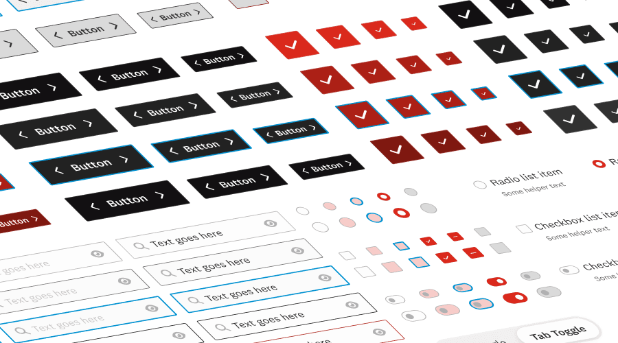
The components file would contain the basic UI elements of the system, such as buttons, inputs, filters, accordions and more.
About 75% of components existed throughout previous design files, which acted as my starting point for building out these elements. Although they were already in Figma, they all needed cleaning up to ensure three things:
One style per component (not counting variants), as there were many slight variations to one component, such as multiple primary buttons with varying padding or border radiuses. [illustration of many button components pointing to one button component]

Components make use of design tokens, via the Foundations file, so design changes to one component propagate to all instances and these token names can be referenced properly in the codebase. [illustration of button using variables]

Components fully utilize of properties, as these make designing more streamlined and mimic the properties in the actual code. [illustration of button with component properties]

As I was looking auditing the current design files, I took note of components that were needed (and would be reused) and I built this latter 25% after combing through and building the initial 75%.
Here’s a quick sample of a few components, their variants and their properties:


File setup
For this design file, I set up the pages how I’d imagine they’d be set up in the codebase. It wasn’t quite like this at first, but after a few discussions with the dev team (in particular, the devs that would be building this), this is the structure we landed on:

And so that’s how it appears in Figma, in the Components file:

Prototype Interactions
In addition to following design system best practices and utilizing Figma component features, where applicable, components also have interactions fully prototyped. Having fully interact-able components is helpful for designers as it streamlines the prototyping process, making it faster to create prototypes that would be close to the final product. As well, it’s helpful for developers as it provides a working version of the component, and its animated properties (e.g. timing, duration, etc.)
Layouts
The layouts file at this stage of the team, was simply a reference for the UI of rennie.com.
Layouts description
This file contain abstract page layouts for various types of pages.
Throughout rennie.com, there are many different layouts used, and this file aims to consolidate the most common ones, in the hopes of being consistent moving forward and UI cohesion is achieved.These layouts are not strict rules, but rather ideal guidelines, that can be used as a starting point and broken if the use case calls for it.
Base layout


Close up of 1440+ Base layout.
Full page layout


Close up of base (mobile) Full page layout.
Implementation
As was often the case at rennie, there were always competing priorities, and because of this, creating and applying the new design system to the site wasn’t feasible. Setting up the design foundations was fairly straightforward—I actually did most of the work there in setting up the .js and .css tokens files. However, creating the components, especially some of the larger components, would have taken more time than the team would have liked, given the long list of things that were coming up.
Build/Improve as we go
Speaking with the managers and the dev team, we felt the best path forward was to build and improve as we go. There were plenty of new things being worked on, and so the team’s approach was that if any new feature involved a newer element/component, we would take the bit of extra time to build the component properly, include it in the new feature and use it going forward. Plenty of pages from the website were still using old design elements, which would be replaced eventually, so that’s why we felt this was the best approach.
Key results
I definitely feel accomplished and pleased with the design system I made for rennie.com. Because it’s a rather rudimentary system, there isn’t much to quantify its success or impact. Though, it checks off all the boxes for what was needed at this stage for the tech team:
✅ Future changes could be made without entanglement
The system is structured in a way where if one element needed an update, then all those instances would be updated. Taking advantage of Figma components (a simple concept, yet so new to the team) and semantic tokens allow for this, so in a few clicks, future team members can just make system-wide changes.
✅ Anyone (who knows how to use Figma) could hop in and use the system easily
Variables are named aptly, so they're easily searchable; and components take full advantage of variant properties, so they’re easy-to-use out of the box and are prototype-ready.
✅ Going from design to development won’t be a headache for the development team.
Tokens, variants and components are named as to match the naming conventions of their counterparts in code. So when it comes to referring to the design files, devs will know which components are what and understand how they should behave within the use experience.
I went on to continue working at rennie, and in my day-to-day work on new features, the design system I built felt successful. I’m obviously very biased in saying this (as the creator of the system), but designing new features was a relative breeze as I didn't have to worry about the precise visuals and rather focus on the user experience.
Intro
When I was hired by rennie, I was contracted to work on their design system for their main real estate website. When I joined, the tech team had bits of a design system, both within Figma and in their codebase. However, the system wasn’t structured in a way that was easily usable on the design front: atomic principles weren’t utilized and there wasn’t even a dedicated Figma file for the system. Some components were coded and being used, but without a design reference to trace them to, future design work was tricky for the team. Alongside the design-code discrepancy, there were old design elements and newer design elements, the former of which would need to be updated to match the style and visual consistency of the newer parts of the system.
Problem
The lack of any standard or system, as well as a designer, was slowing down the tech team.
There were heaps of work in adapting the old to the new, as well as exploring new features—this could all be done without me or a design system in place, but the team saw that proceeding without one would create more problems and headaches down the road.
Alongside the team, my goal was to have a standardized design library that would exist in Figma and usable within the codebase. This system would be built from the ground up, using best practices, so that:
Future changes could be made without entanglement;
Anyone (who knows how to use Figma) could hop in and use the system easily
Going from design to development won’t be a headache for the development team.
Approach
System audit
I didn’t completely start this project from scratch, but looking back, it felt like I did.
Looking through existing Figma files, I saw that there were some bigger components already made—which even had their code counterpart in Storybook—but I didn’t find a set of simpler UI elements (such as radio buttons, select boxes, toggles, etc.). They were there, however they weren’t Figma components and were seemingly duplicated and scattered throughout the file.
To complement some of the existing components: there were existing text styles and a color map. Though, these text styles lacked a uniform font properties (e.g. font-size) and the color map lacked a range of colors to utilize, which is very much needed in product or web design to account for different states and use cases.
Designing the system
To keep things simple and pragmatic, I kept to atomic design principles when laying out the system. There were bits of the newer elements scattered throughout old files—which was my starting point—so those just needed to be collected, fleshed out, and reorganized. In following atomic design, to start, the system would consist of three main files: Foundation, Components, and Layouts.
Foundation
The foundations file, as the name suggests, is the atoms of the system, containing: units, grids, colors, font properties, type styles, and effects. As the ground layer of the system, setting these up thoughtfully was important as they would be the base reference of the system and be used by the other parts of the system.
Colors
The color map took the most time, as a number of colors were lacking from existing files. Having previously gone through the headache of figuring out variable shades in previous work, having a full color map is crucial in product design. This means having a light (100) to dark (900) range across various hues.
For the main colors, to expand their color range, I simply worked from their main color in the HSL system, and adjusted the light, or L, value accordingly. So if a color had an L value of 50, that would put it within the 500 range, and then from there, the L value reflects the inverse e.g. an L value of 78 (rounding to 80) would be in the 200 range, or an L value of 13 (rounding to 10) would be in the 900 range.
Semantic Tokens
Semantic tokens are variables that refer to base variables and are named to describe what they’re used for, e.g. btn-primary might be a token to describe the main background color. I’m sure there’s a good explanation or article explaining the thought behind it, but for simpletons like me, they’re incredibly useful for ensuring consistency in the UI and avoiding a headache if any changes occur in the future.
These tokens are mainly used for colors, but in this design system, they’ve also been used for padding, effects, and other foundational elements.
Sample set of semantic tokens for color names.
Semantic tokens for padding.
Font Tokens
Font variables were set up for each property of a type style. A number of these variables were carried over from what was existing previously, but one change made was that to the font-size. For this, I opted for -X00 convention, as it made the most sense (after looking through a number of other design system naming conventions) where size 100 would be the default size, at 1rem or 16px, and the numbers could scale down or up accordingly. So for example, size 025 (0.5rem/8px) would be the smallest font size the system would include.
Grids
The grids of the system were adopted from some of the early design system work and the newer designs of rennie.com. There’s three main grids: base (which was renamed from mobile), 768+ and 1440+. The naming convention may be subjective, though I opted for the more literal approach as it feels more pragmatic when referring to a particular screen size.
Icons
rennie used Font Awesome 6 as its icon library, making usage within the design system a breeze, with a slight learning curve. Because Font Awesome turns words into glyphs, icons can be conveniently referenced through a text property.
Other Foundation Sections
Components
The components file would contain the basic UI elements of the system, such as buttons, inputs, filters, accordions and more.
About 75% of components existed throughout previous design files, which acted as my starting point for building out these elements. Although they were already in Figma, they all needed cleaning up to ensure three things:
One style per component (not counting variants), as there were many slight variations to one component, such as multiple primary buttons with varying padding or border radiuses. [illustration of many button components pointing to one button component]
Components make use of design tokens, via the Foundations file, so design changes to one component propagate to all instances and these token names can be referenced properly in the codebase. [illustration of button using variables]
Components fully utilize of properties, as these make designing more streamlined and mimic the properties in the actual code. [illustration of button with component properties]
As I was looking auditing the current design files, I took note of components that were needed (and would be reused) and I built this latter 25% after combing through and building the initial 75%.
Here’s a quick sample of a few components, their variants and their properties:
File setup
For this design file, I set up the pages how I’d imagine they’d be set up in the codebase. It wasn’t quite like this at first, but after a few discussions with the dev team (in particular, the devs that would be building this), this is the structure we landed on:
And so that’s how it appears in Figma, in the Components file:
Prototype Interactions
In addition to following design system best practices and utilizing Figma component features, where applicable, components also have interactions fully prototyped. Having fully interact-able components is helpful for designers as it streamlines the prototyping process, making it faster to create prototypes that would be close to the final product. As well, it’s helpful for developers as it provides a working version of the component, and its animated properties (e.g. timing, duration, etc.)
Layouts
The layouts file at this stage of the team, was simply a reference for the UI of rennie.com.
Layouts description
This file contain abstract page layouts for various types of pages.
Throughout rennie.com, there are many different layouts used, and this file aims to consolidate the most common ones, in the hopes of being consistent moving forward and UI cohesion is achieved.These layouts are not strict rules, but rather ideal guidelines, that can be used as a starting point and broken if the use case calls for it.
Base layout
Close up of 1440+ Base layout.
Full page layout
Close up of base (mobile) Full page layout.
Implementation
As was often the case at rennie, there were always competing priorities, and because of this, creating and applying the new design system to the site wasn’t feasible. Setting up the design foundations was fairly straightforward—I actually did most of the work there in setting up the .js and .css tokens files. However, creating the components, especially some of the larger components, would have taken more time than the team would have liked, given the long list of things that were coming up.
Build/Improve as we go
Speaking with the managers and the dev team, we felt the best path forward was to build and improve as we go. There were plenty of new things being worked on, and so the team’s approach was that if any new feature involved a newer element/component, we would take the bit of extra time to build the component properly, include it in the new feature and use it going forward. Plenty of pages from the website were still using old design elements, which would be replaced eventually, so that’s why we felt this was the best approach.
Key results
I definitely feel accomplished and pleased with the design system I made for rennie.com. Because it’s a rather rudimentary system, there isn’t much to quantify its success or impact. Though, it checks off all the boxes for what was needed at this stage for the tech team:
✅ Future changes could be made without entanglement
The system is structured in a way where if one element needed an update, then all those instances would be updated. Taking advantage of Figma components (a simple concept, yet so new to the team) and semantic tokens allow for this, so in a few clicks, future team members can just make system-wide changes.
✅ Anyone (who knows how to use Figma) could hop in and use the system easily
Variables are named aptly, so they're easily searchable; and components take full advantage of variant properties, so they’re easy-to-use out of the box and are prototype-ready.
✅ Going from design to development won’t be a headache for the development team.
Tokens, variants and components are named as to match the naming conventions of their counterparts in code. So when it comes to referring to the design files, devs will know which components are what and understand how they should behave within the use experience.
I went on to continue working at rennie, and in my day-to-day work on new features, the design system I built felt successful. I’m obviously very biased in saying this (as the creator of the system), but designing new features was a relative breeze as I didn't have to worry about the precise visuals and rather focus on the user experience.
content
Title
Title