content
Title
Case study
What I’ve done at Donorbox (so far)

Here’s a brief collection of the major projects I’ve worked on at Donorbox so far. Of course it’s not everything I’ve worked on, as there’s many smaller improvements I’ve made a long the way, but this is just a quick, birds-eye view of my major contributions at this company.
These projects took time, many iterations and back-and-forths which I don’t delve into because the average visitor ain’t reading all that—I’ve been a designer for 8+ years and I have the data TO KNOW FOR A FACT few people read these case studies. However, if you’re interested, I can gladly get into the details of these projects. 🙋
New Navigation Bar
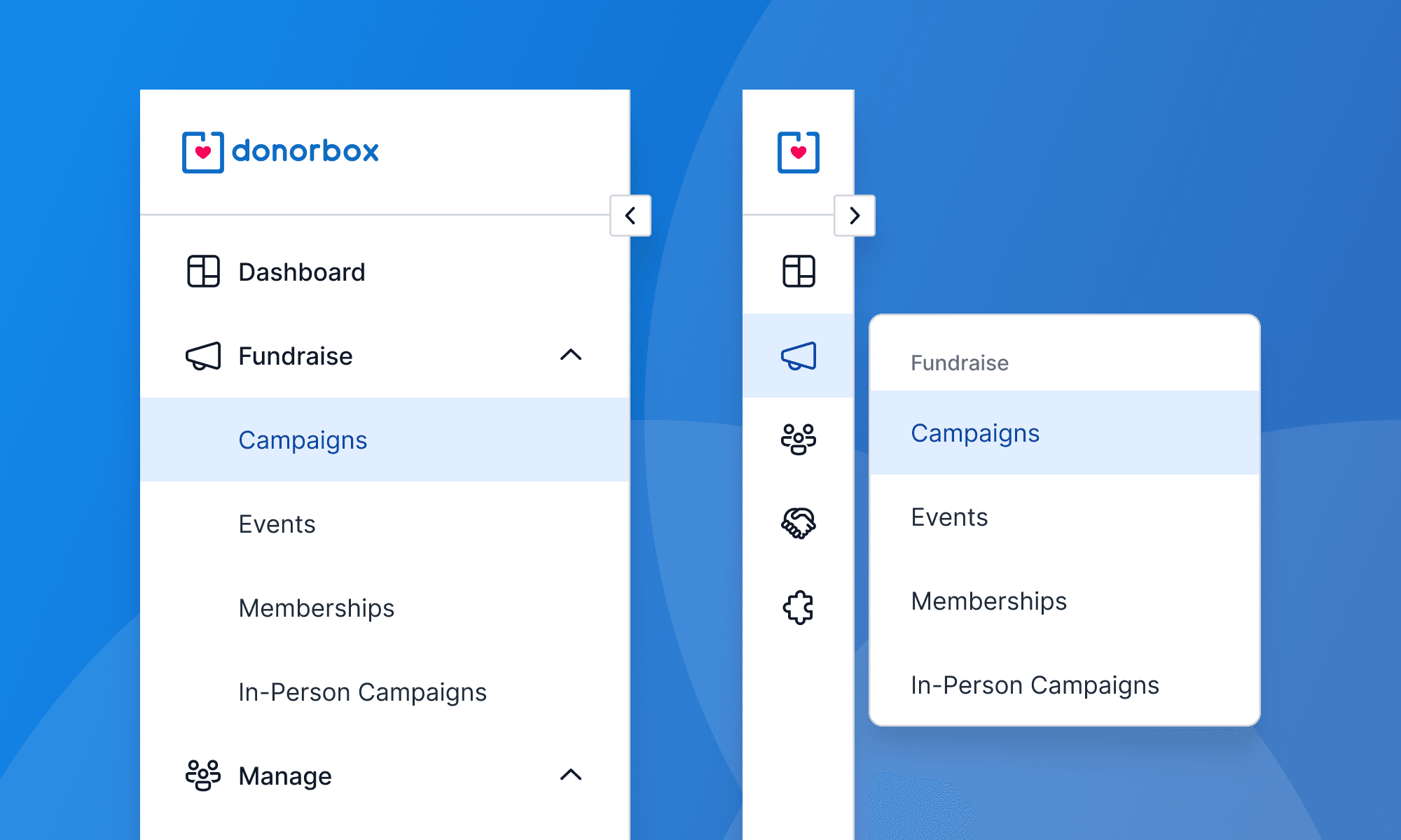
A long-neglected piece of the app, the navigation bar for the Donorbox app was in need of an update. This update was both a visual and functional update: font styles and the appropriate iconography of the design system were applied; and usability features were given to nav bar to be more usable in a variety of contexts.
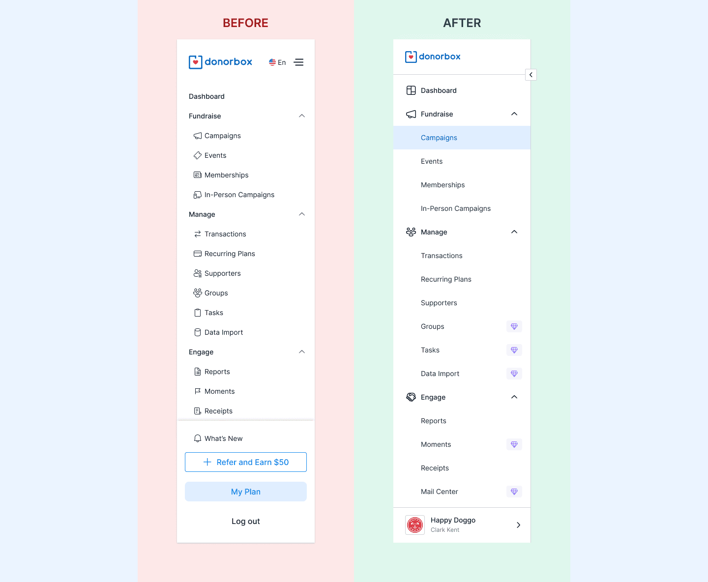
The usability features were in dire need as previously, the nav bar could only simply be opened and collapsed, with not only no access to the bar in the collapsed state but also no visual of where the user was in the app. With the update, the user can know where they are in the app, no matter if the bar was closed or open, as well as interact with the navigation in either state.
Impact
Such a trivial difference and—for the longest time—an underlooked feature, but this was a much needed quality-of-life change within the Donorbox app. Not just me, a designer, annoyed every time I opened the app and had to move around the app, but it was a known annoyance amongst the company and the userbase that’s no more.
Account + Profile Overlay

In addition to the new navigation bar, a new section in the navigation was created to properly house the account and organization settings. This reorganization and declutter was another welcome addition to the app, where previous care wasn’t taken nor—as someone who was coming in as a new observer—apparently considered.
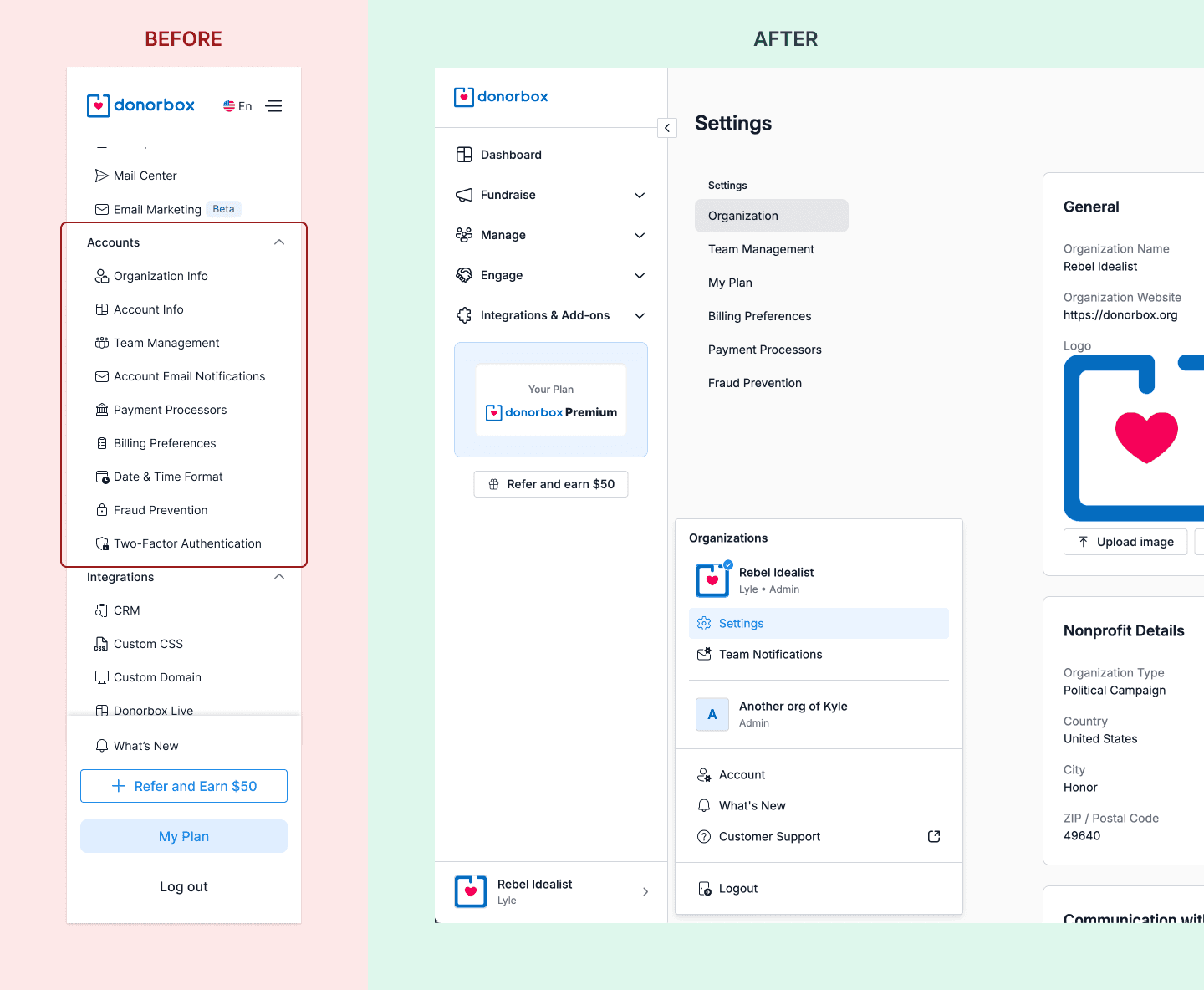
What was once just an unorganized list of items in the navigation now all lived in its own page, tucked into a toggle-able account overlay, for all things related to the account: organizations (status and switching between different orgs), what’s new in the app, accessing support and logging out.
Impact
Though another project that’s difficult to quantify—and frankly, I don’t think it’s worth measuring (with data, at least)—this project’s positive impact was made known anecdotally through customer calls and chats with the company’s nonprofit experts.
Ticket Packages
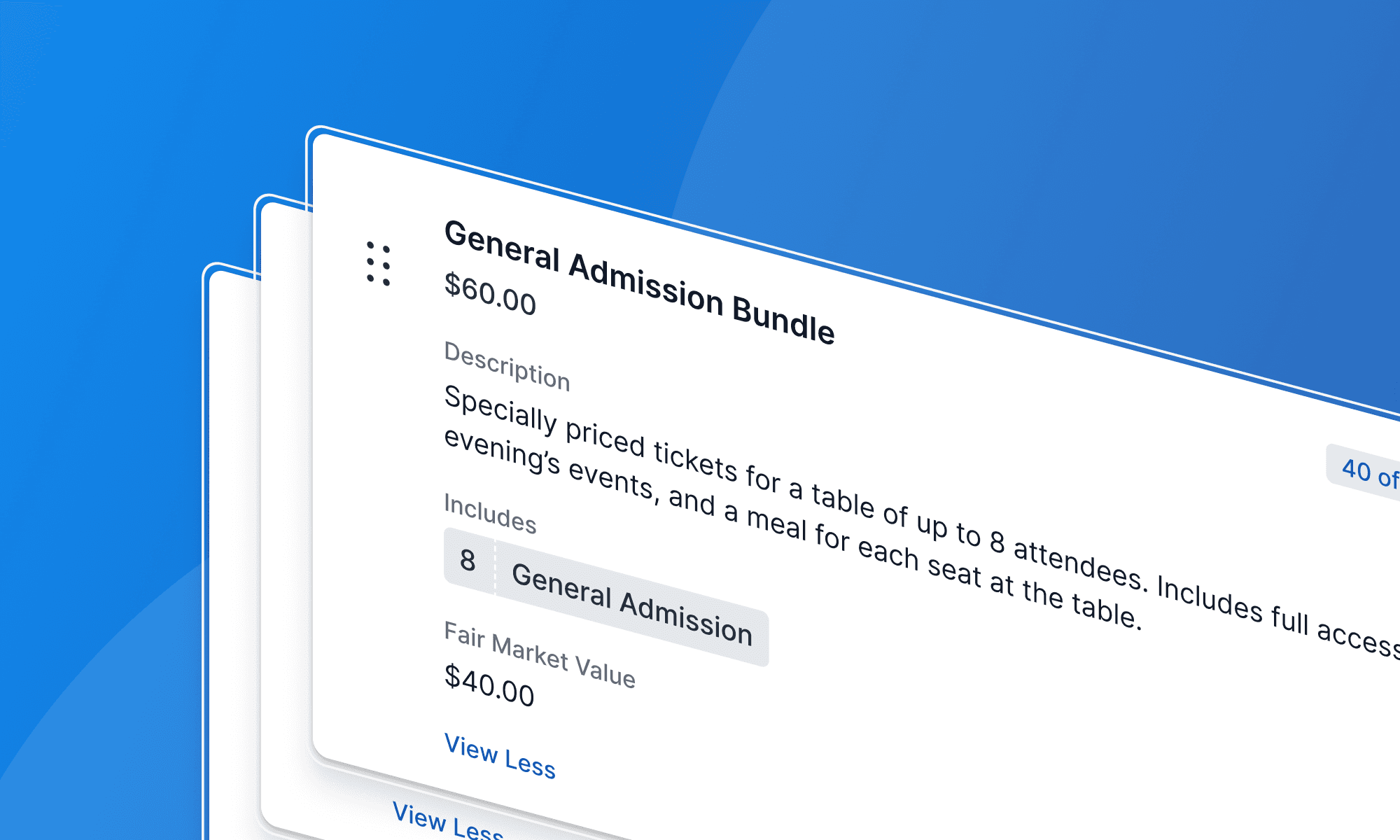
Donorbox offers an events platform for nonprofits and organizations, where tickets can be bought by their event attendees and fully managed by the staff—duh, it’s an event platform.
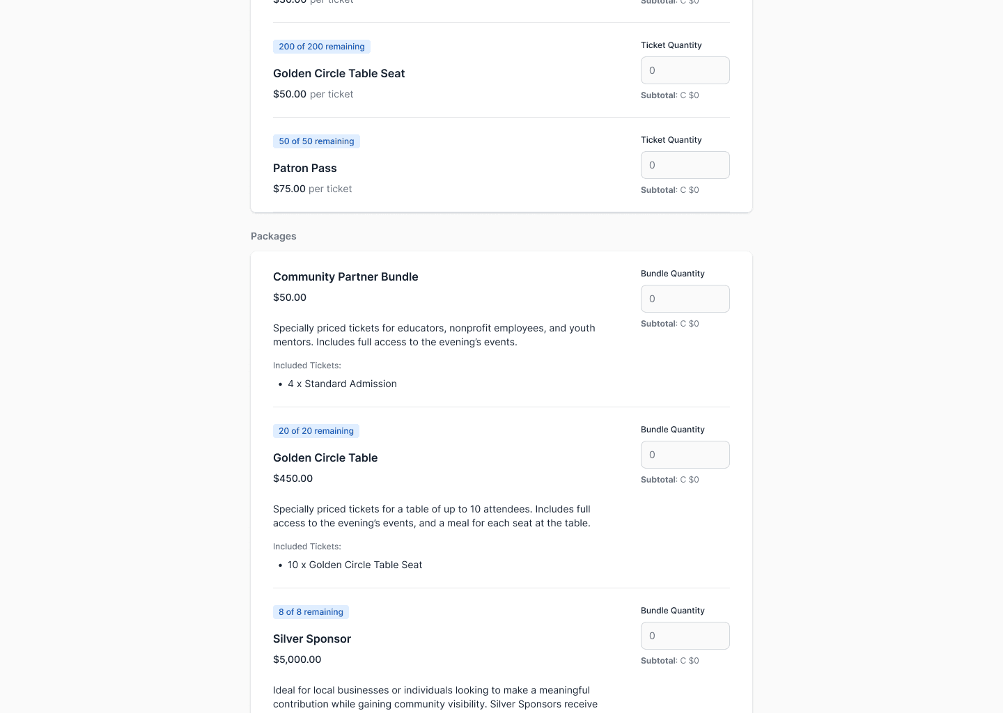
What was missing and often sought out was packaging tickets together, for various purposes including (but not limited to): bundling tickets for a discount, for table seating, or to sell to sponsors.
Buying a ticket package as an attendee
Impact
The first iteration of this feature did just that and saw the intended usage from organizations utilizing ticket packages—we saw orgs mainly using it for table seating, selling sponsorships (which include various tickets), and to sell extra perks for the event, which we thought was a different use case than expected.
Like most product teams, we have a lot on our plate at any given moment, but this project is one we’re looking to improve and expand upon because of the ongoing usage and interest.
Here’s a brief collection of the major projects I’ve worked on at Donorbox so far. Of course it’s not everything I’ve worked on, as there’s many smaller improvements I’ve made a long the way, but this is just a quick, birds-eye view of my major contributions at this company.
These projects took time, many iterations and back-and-forths which I don’t delve into because the average visitor ain’t reading all that—I’ve been a designer for 8+ years and I have the data TO KNOW FOR A FACT few people read these case studies. However, if you’re interested, I can gladly get into the details of these projects. 🙋
New Navigation Bar
A long-neglected piece of the app, the navigation bar for the Donorbox app was in need of an update. This update was both a visual and functional update: font styles and the appropriate iconography of the design system were applied; and usability features were given to nav bar to be more usable in a variety of contexts.
The usability features were in dire need as previously, the nav bar could only simply be opened and collapsed, with not only no access to the bar in the collapsed state but also no visual of where the user was in the app. With the update, the user can know where they are in the app, no matter if the bar was closed or open, as well as interact with the navigation in either state.
Impact
Such a trivial difference and—for the longest time—an underlooked feature, but this was a much needed quality-of-life change within the Donorbox app. Not just me, a designer, annoyed every time I opened the app and had to move around the app, but it was a known annoyance amongst the company and the userbase that’s no more.
Account + Profile Overlay
In addition to the new navigation bar, a new section in the navigation was created to properly house the account and organization settings. This reorganization and declutter was another welcome addition to the app, where previous care wasn’t taken nor—as someone who was coming in as a new observer—apparently considered.
What was once just an unorganized list of items in the navigation now all lived in its own page, tucked into a toggle-able account overlay, for all things related to the account: organizations (status and switching between different orgs), what’s new in the app, accessing support and logging out.
Impact
Though another project that’s difficult to quantify—and frankly, I don’t think it’s worth measuring (with data, at least)—this project’s positive impact was made known anecdotally through customer calls and chats with the company’s nonprofit experts.
Ticket Packages
Donorbox offers an events platform for nonprofits and organizations, where tickets can be bought by their event attendees and fully managed by the staff—duh, it’s an event platform.
What was missing and often sought out was packaging tickets together, for various purposes including (but not limited to): bundling tickets for a discount, for table seating, or to sell to sponsors.
Buying a ticket package as an attendee
Impact
The first iteration of this feature did just that and saw the intended usage from organizations utilizing ticket packages—we saw orgs mainly using it for table seating, selling sponsorships (which include various tickets), and to sell extra perks for the event, which we thought was a different use case than expected.
Like most product teams, we have a lot on our plate at any given moment, but this project is one we’re looking to improve and expand upon because of the ongoing usage and interest.
content
Title